A family story since 1944, given a new expression.
Rakija Toja — Serbian fruit brandy repositioning, identity & packaging design
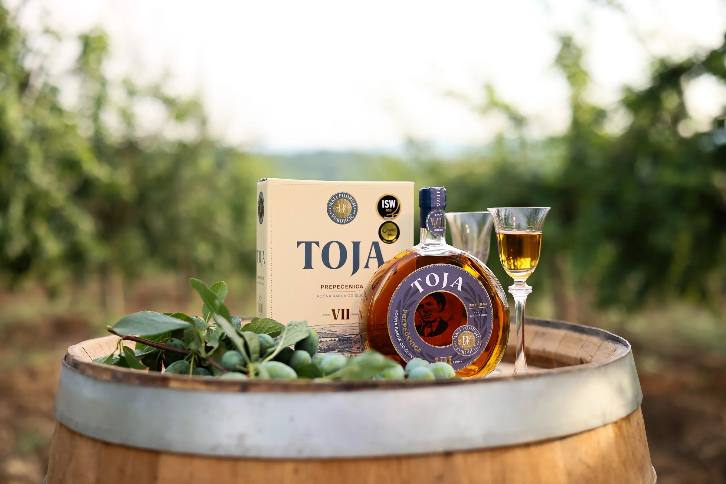
A traditional Serbian rakija brand, not redesigned to look old, but designed to make its history matter today.
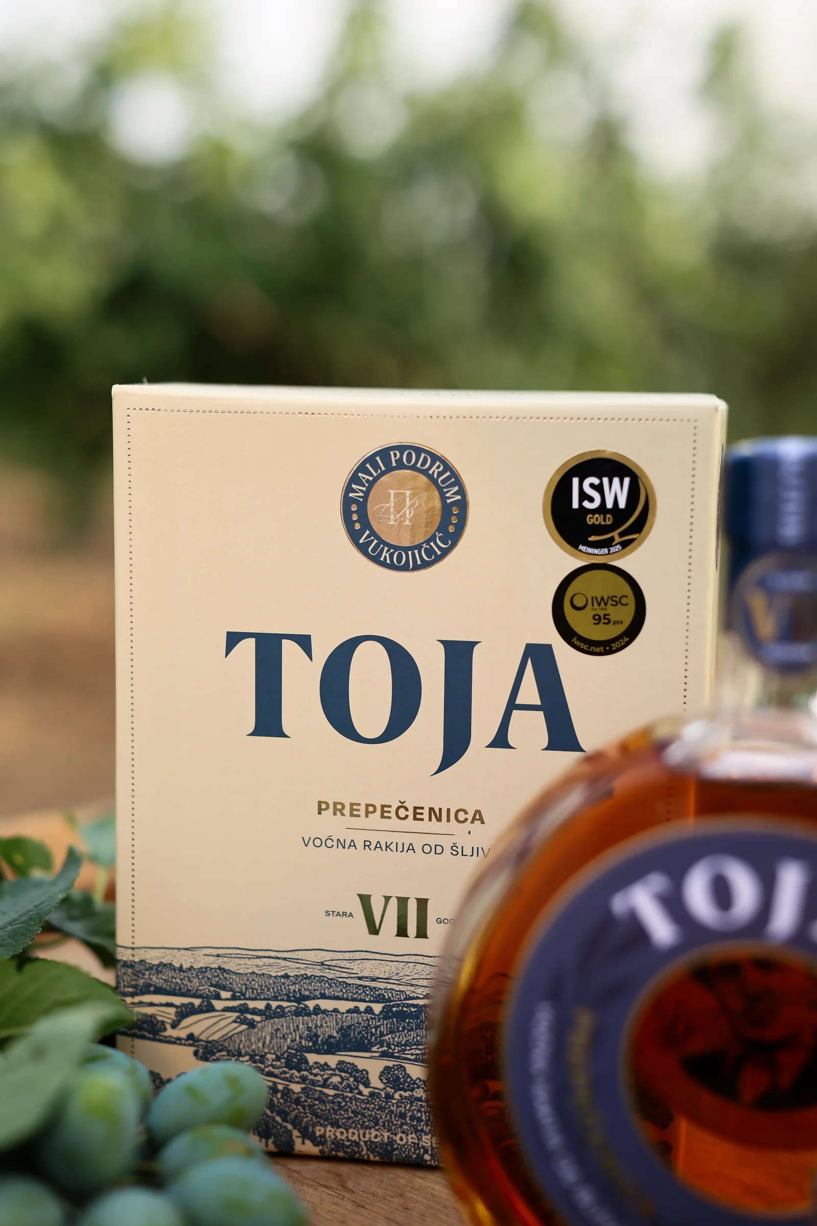
ZERO11 repositioned Toja, a Serbian fruit brandy from Podrum Vukojičić in Rekovac, in the heart of Levač, and created its visual identity and packaging design with creative and art direction across the range. The story began in 1944, when the family started producing rakija from fruit grown on their own estate. The challenge was not to make Toja look more traditional, but to make that tradition relevant, without turning heritage into nostalgia.
About the client
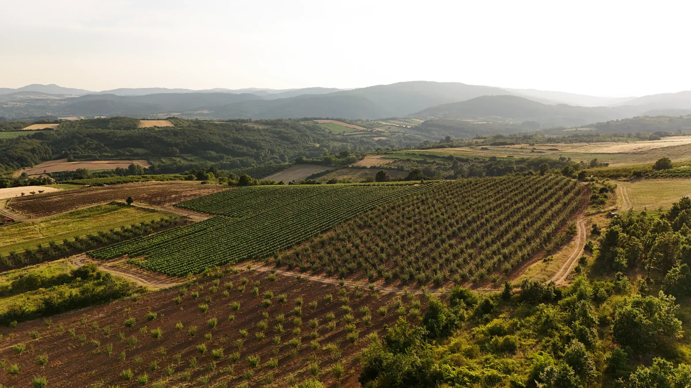
Toja is a Serbian fruit brandy from Podrum Vukojičić in Rekovac, in the heart of Levač.
The story began in 1944, when the family started producing rakija from fruit grown on their own estate. Today, traditional double distillation is combined with modern production technology, while the fruit is carefully selected from the Gledić Mountains.
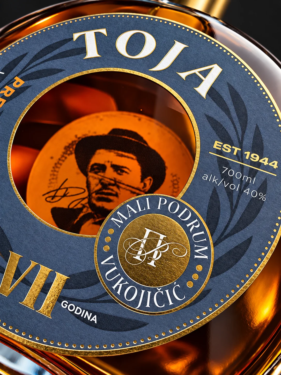
The name Toja comes from the family nickname of the man who began the story.
The brief
Toja already had what many brands try to manufacture: provenance, history and a genuine family story.
The challenge was not to make it look more traditional.
It was to make that tradition relevant.
The brand needed a stronger identity and packaging system capable of expressing the quality of the product, communicating its Serbian origin and giving the range a more distinctive and premium presence.
Without turning heritage into nostalgia.
The design solution
We repositioned Toja around the strength of its origin and the simplicity of its story.
From the heart of Levač. Since 1944.
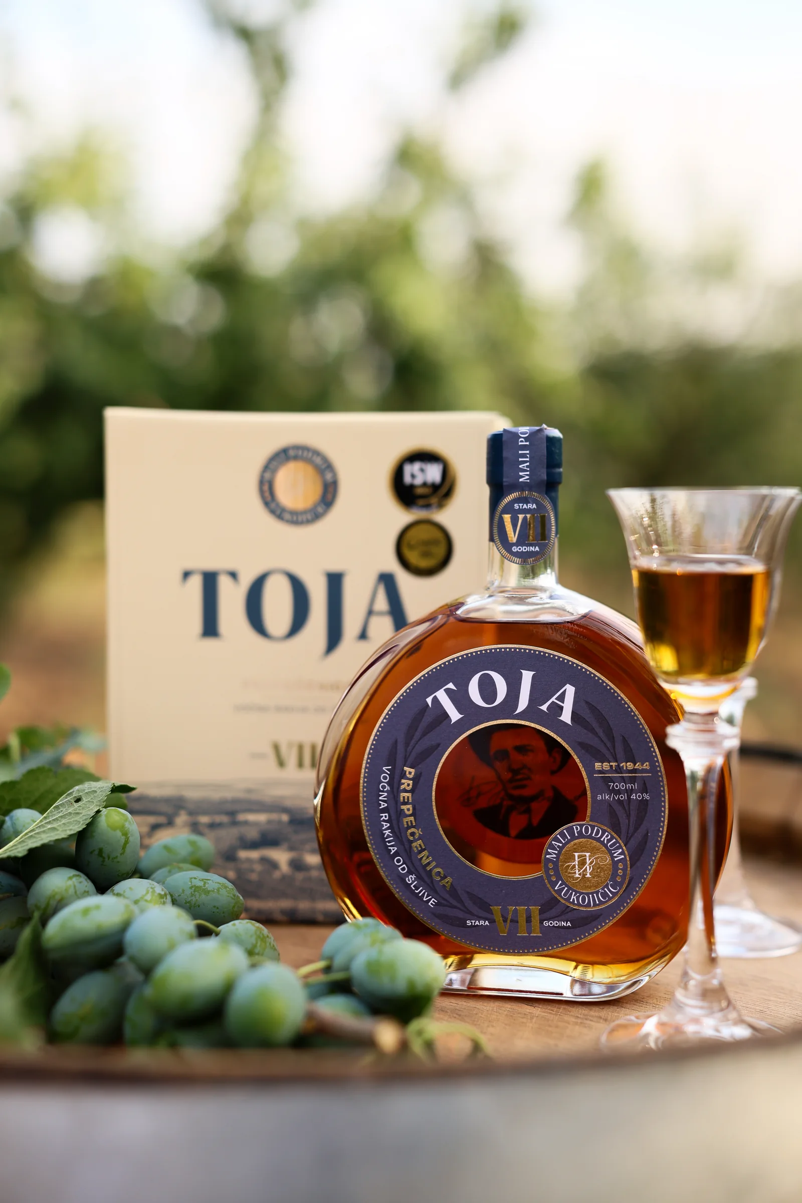
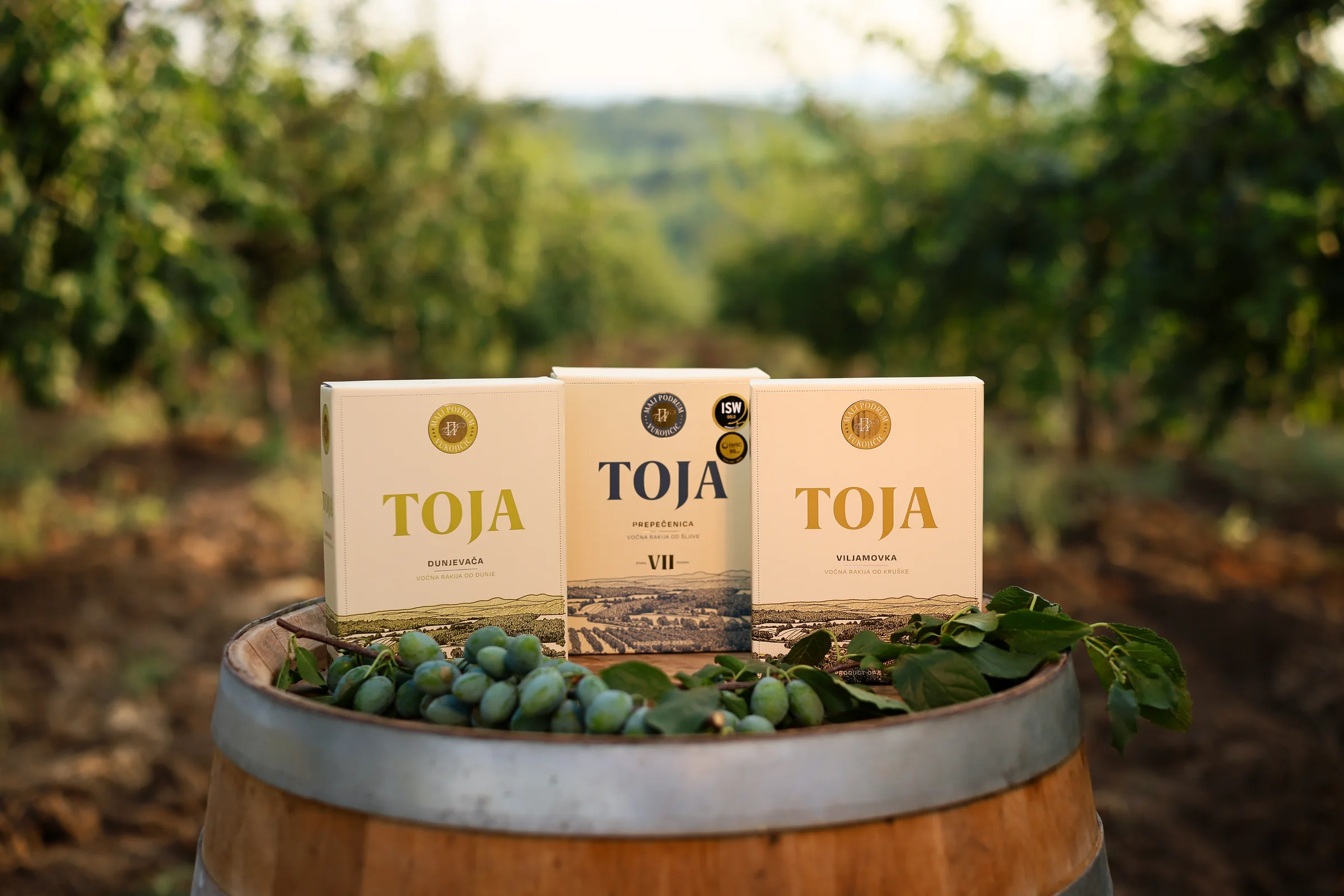
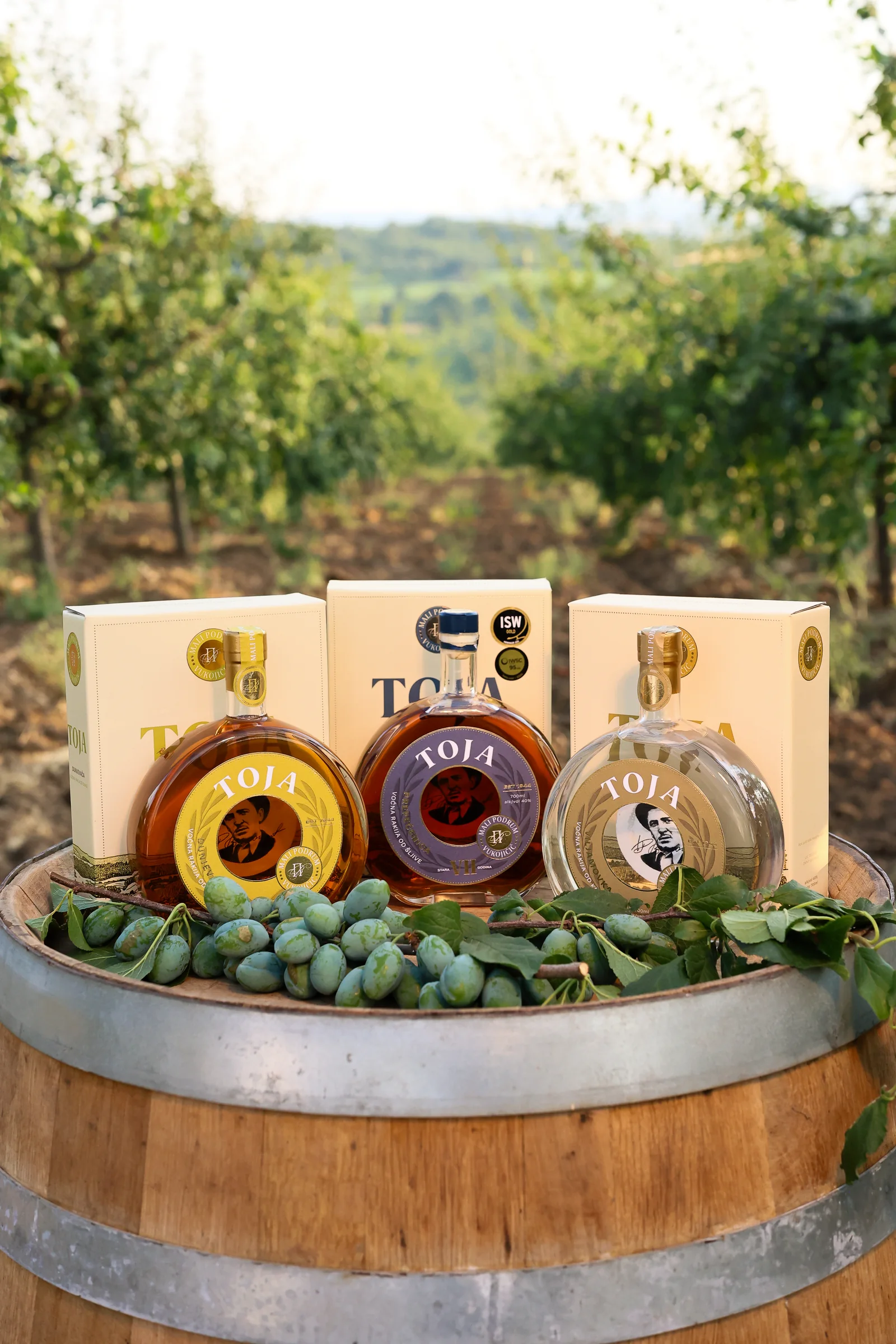
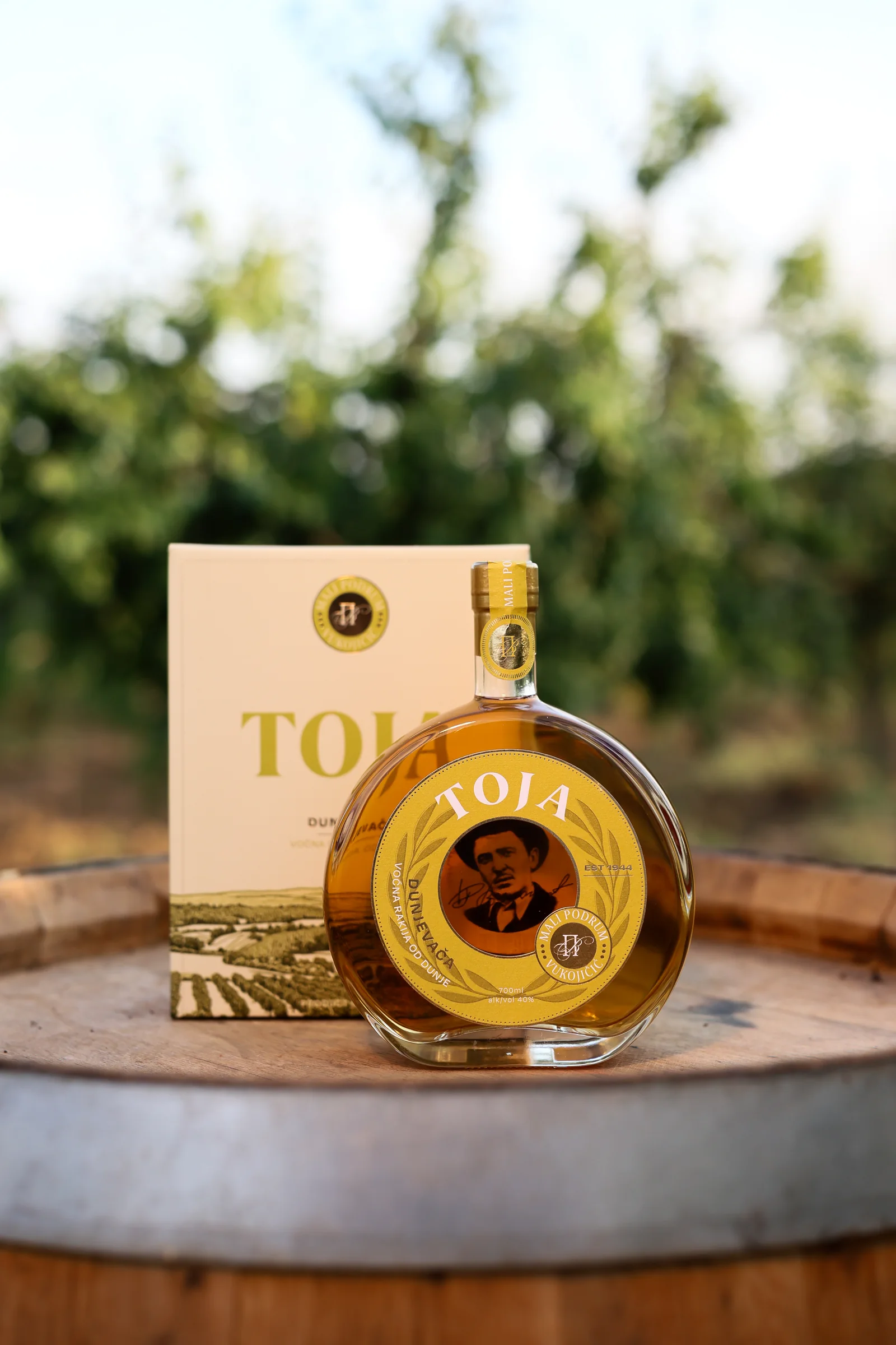
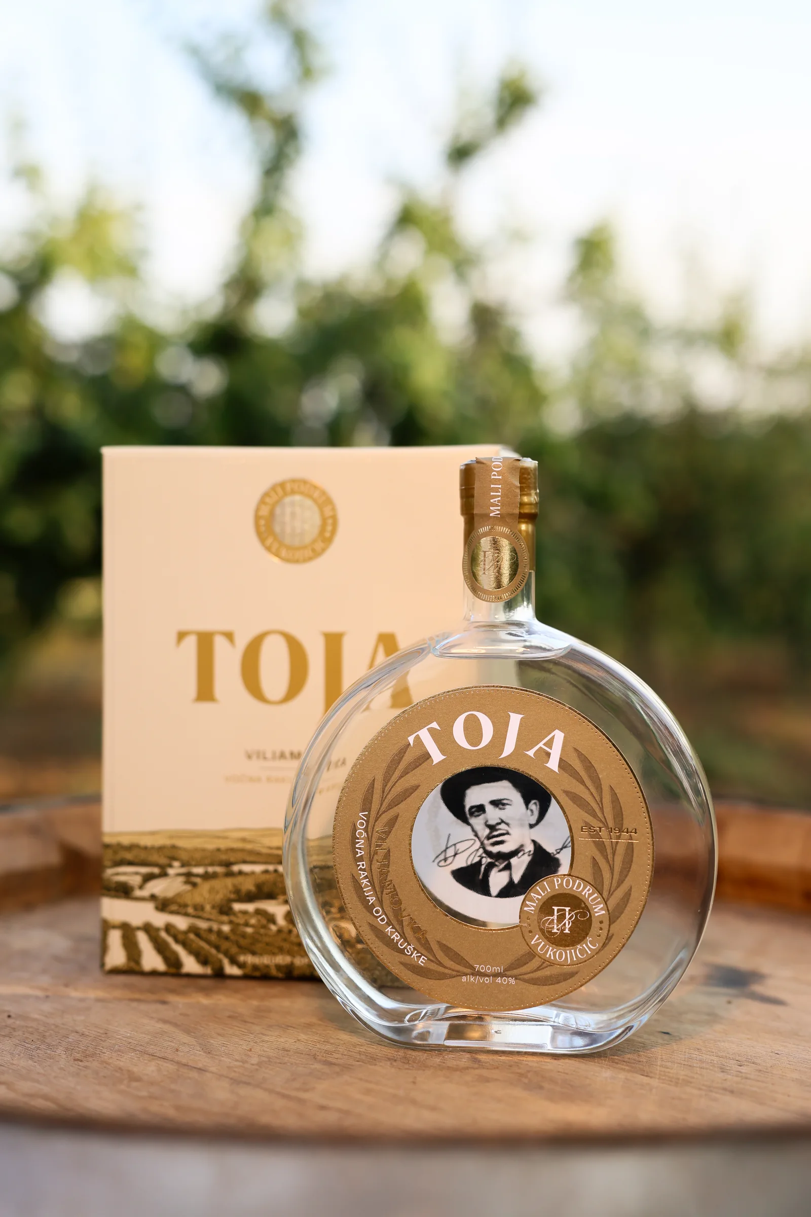
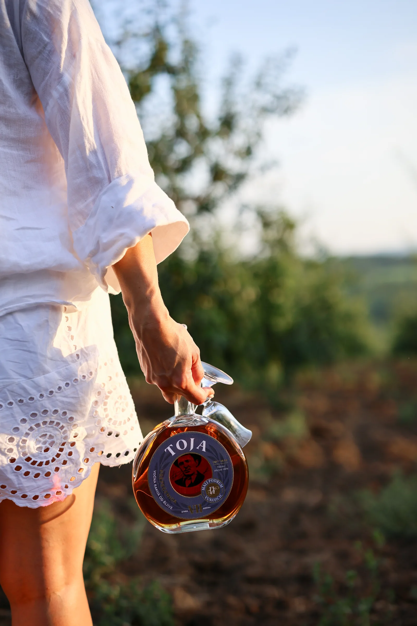
The visual identity and packaging were designed to balance tradition with contemporary clarity. Rather than filling the label with decorative heritage cues, the system gives the brand, the fruit and the provenance room to speak.
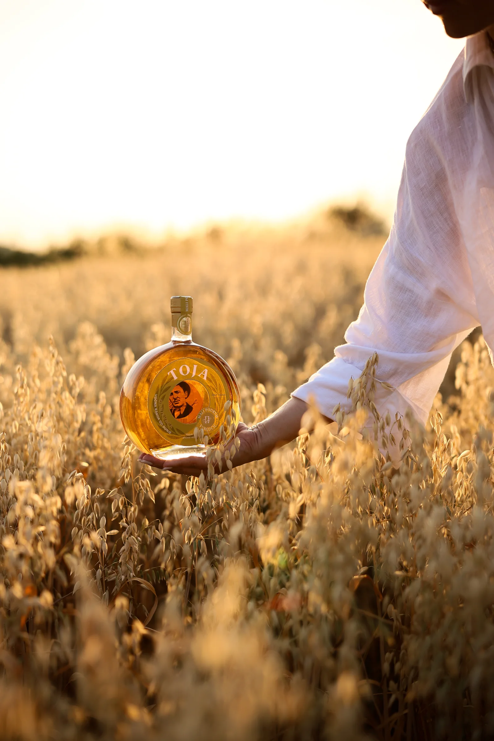
The range includes Plum, Pear and Quince, with each expression built around the character of the fruit while remaining unmistakably part of the same family.
Toja Plum is produced from Crvena Ranka and Požegača plums. Toja Pear uses Williams pear, while Toja Quince is made from Leskovac quince and matured in oak.
Together, the bottles create a coherent premium range rooted in place, family and craft.
A traditional Serbian rakija brand, not redesigned to look old, but designed to make its history matter today.
Have a product that needs to work harder?
Whether you are launching something new, rebuilding an existing brand or trying to make a complex portfolio clearer, we can help.