Premium ice cream made impossible to overlook.
Gelado Ice Creams — Ice cream packaging design & art direction
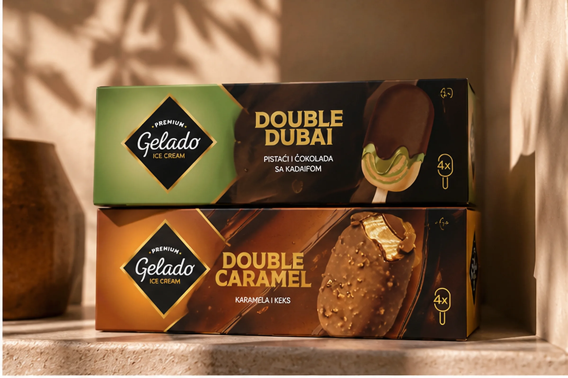
A packaging language that communicates flavour quickly and stays unmistakably Gelado across the range.
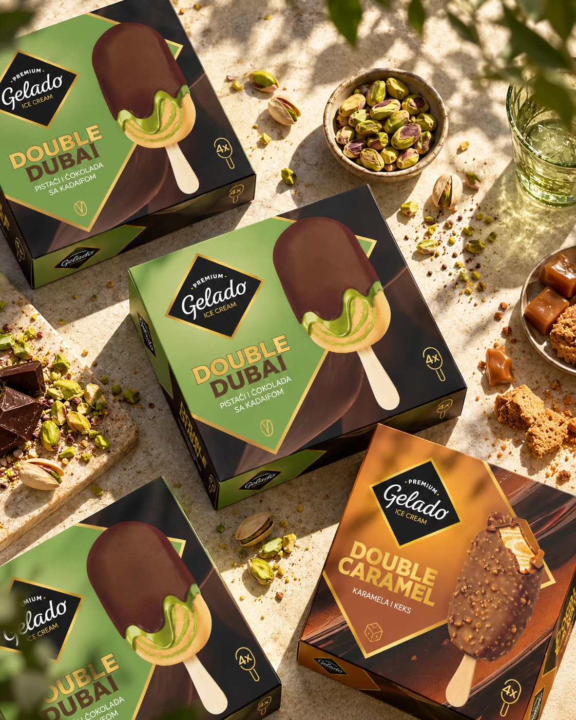
ZERO11 created the packaging design and led the creative and art direction for Gelado, an ice cream range created for DIS, built around indulgent flavours and a strong retail presence. The aim was a packaging language that communicates flavour quickly, feels contemporary and premium, and stays unmistakably Gelado across the range, from Double Dubai to Double Caramel.
About the client
Gelado is an ice cream range created for DIS, with a portfolio built around indulgent flavours and a strong retail presence.
The challenge was to give the brand a packaging language that could communicate flavour quickly, feel contemporary and premium, and remain unmistakably Gelado across the range.
The brief
Ice cream is an emotional category.
People buy with their eyes long before they read ingredients or product details. Colour, texture, flavour cues and appetite all have to work immediately.
For Gelado, the packaging needed to make indulgence visible at first glance while creating a clear system that could stretch across different flavours and product combinations.
It had to feel premium without becoming distant or overly sophisticated.
The design solution
We built the packaging around bold flavour recognition and strong visual contrast.
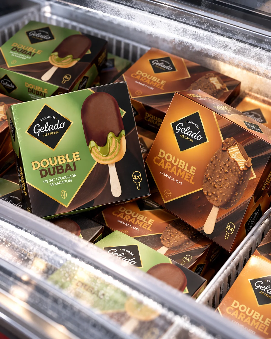
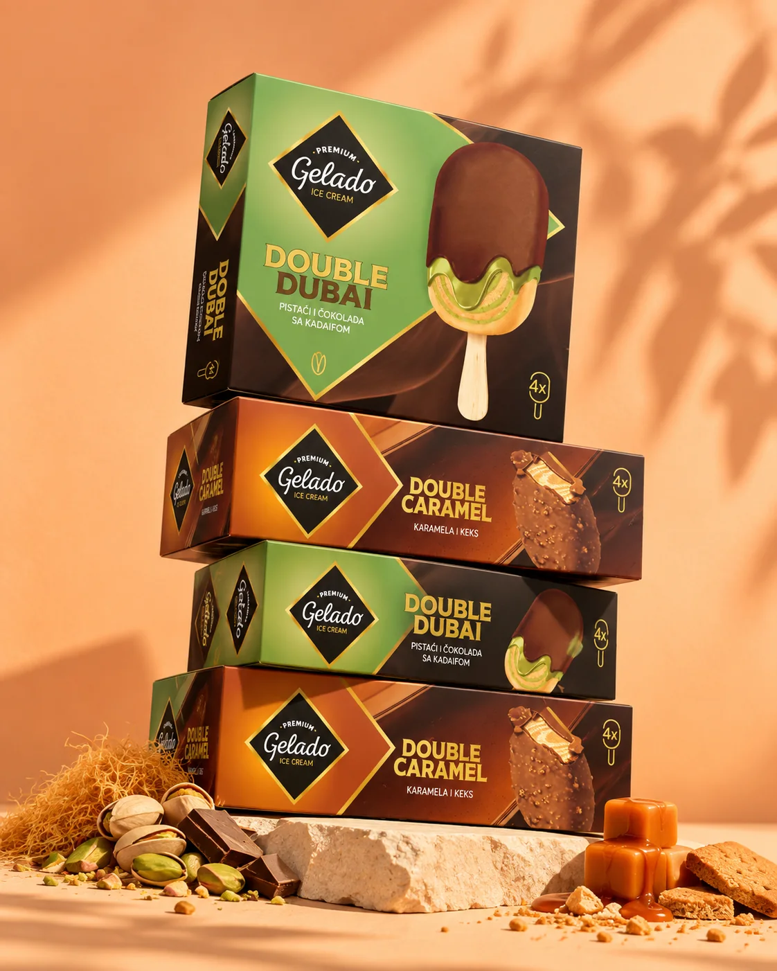
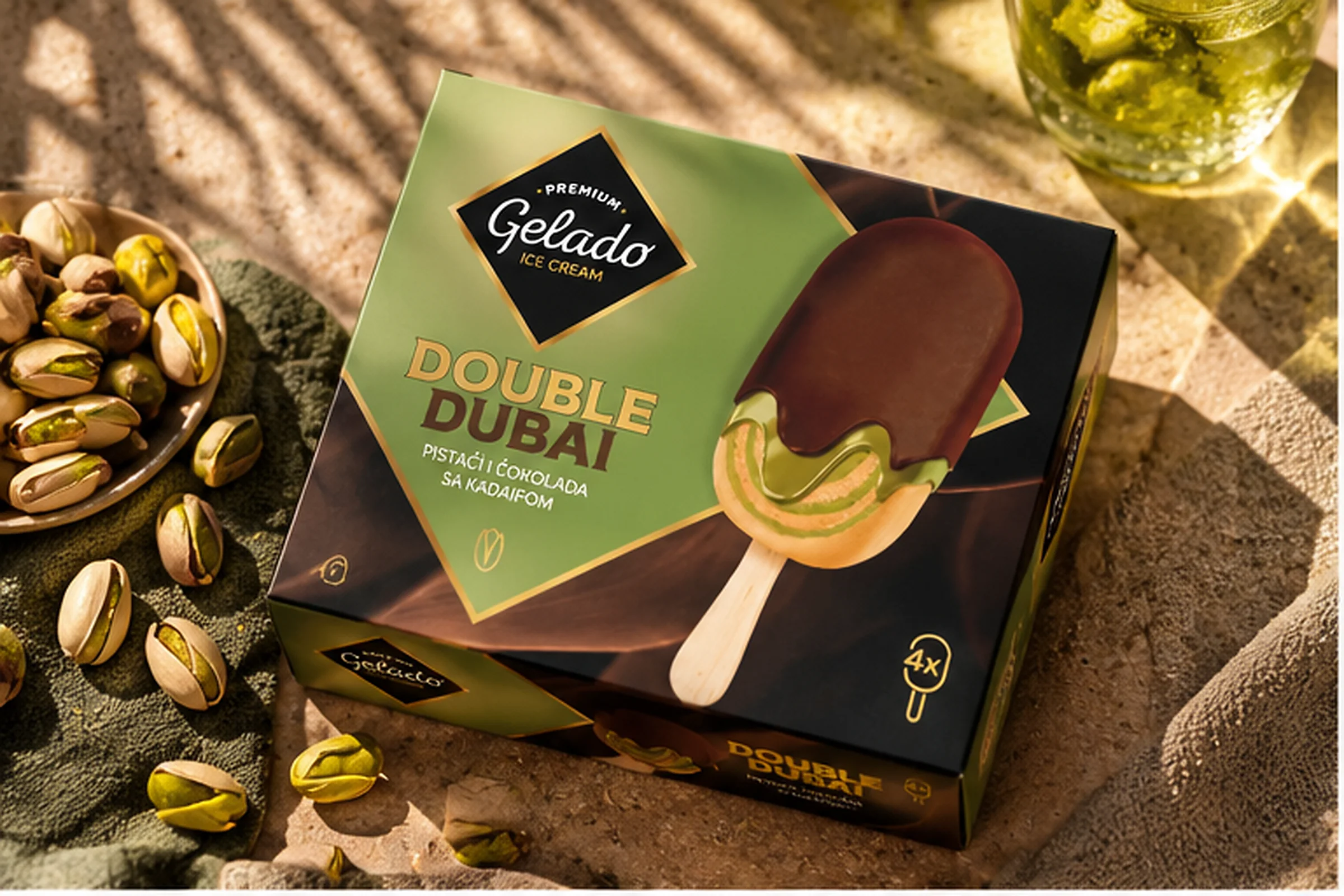
The Gelado identity stays consistent across the range, while each product creates its own world through colour, ingredient imagery and flavour-led typography.
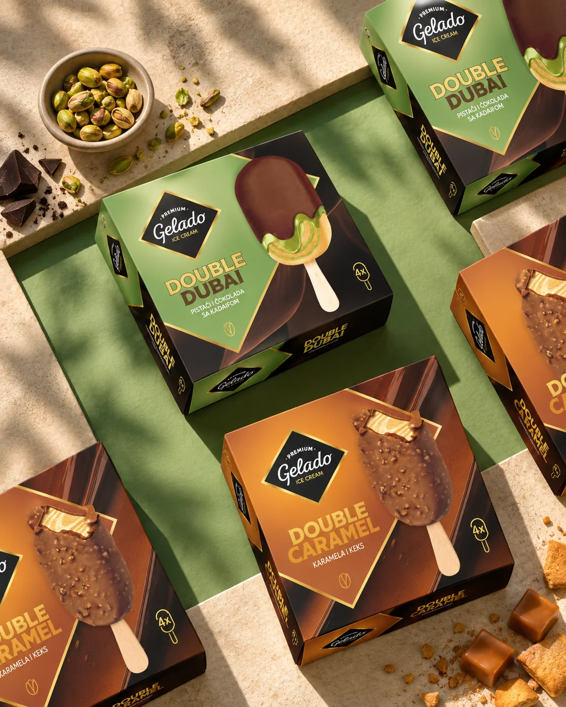
For products such as Double Dubai and Double Caramel, the design makes the flavour combination the hero. Pistachio, chocolate, kadaif, caramel and biscuit are presented with enough richness to create appetite, but within a controlled system that keeps the range coherent.
The square format, strong central branding and distinctive colour territories give Gelado a clear presence both individually and as a family.
The result is packaging designed to do exactly what ice cream packaging needs to do.
Make you want it before you have even opened the box.
Have a product that needs to work harder?
Whether you are launching something new, rebuilding an existing brand or trying to make a complex portfolio clearer, we can help.