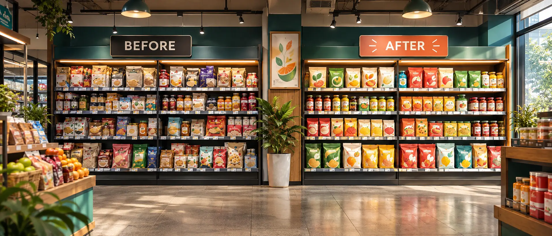
Recognition is one of a brand’s most valuable assets. A redesign should move the brand forward without asking shoppers to learn it again.
Recognition is an asset
Shoppers who already buy a product rarely read its pack. They recognise it. That recognition has been built over years, and it is easy to damage in a redesign that changes too much at once.
Find what people actually recognise
The elements a team thinks define the brand are not always the ones shoppers use to find it. Before changing anything, we look at what actually carries recognition on the shelf.
- Colour and the way it is distributed across the pack.
- Pack shape, structure and format.
- The logo, its position and its proportions.
- Key imagery, characters or illustration styles.
“Change what is tired.Protect what is remembered.”
Evolve in steps, not leaps
Modernising does not have to mean replacing. Often the strongest redesigns keep the memorable cues and improve everything around them: hierarchy, typography, finish and the clarity of the message. The result feels fresh to new shoppers and familiar to loyal ones.

Test before you commit
A redesign should be checked against the way people actually shop, not just against internal opinion.
- Compare old and new designs side by side at shelf distance.
- Check that the key recognition cues survive at small sizes.
- Look at the new design next to competitors, not in isolation.
If shoppers can still find the product in a second or two and it looks better doing so, the redesign is doing its job.