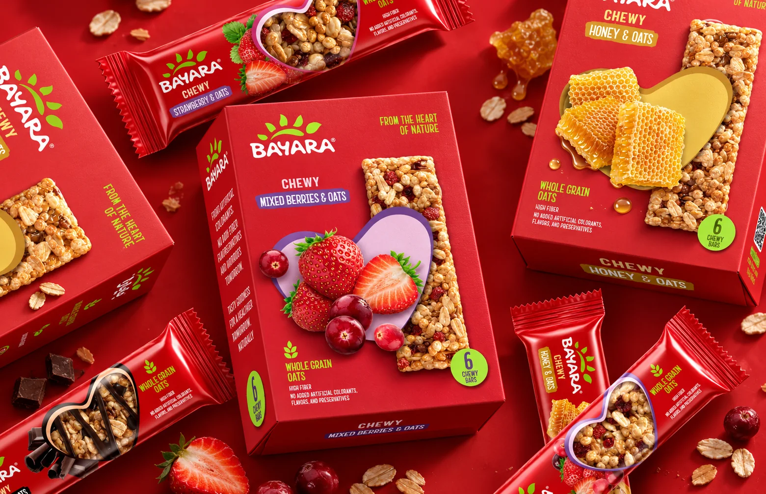
A recognisable red packaging system designed to bring clarity across Bayara’s growing snack and oat bar range.
ZERO11 created the packaging design and range architecture for Bayara’s snack bar range, with visual direction and creative and art direction, for one of the Middle East’s best-known food brands. The range spans bars built around oats, nuts, fruit, chocolate and honey, in single bars, multipacks and a growing set of oat-based products. The aim was a more immediate, appetite-led system that keeps Bayara’s red and makes each flavour easier to recognise and choose.
About the client
Bayara is one of the Middle East’s best-known food brands, with a portfolio spanning nuts, dried fruit, seeds, spices and everyday snacking products.
For its snack bar range, the opportunity was to create a clearer and more appetite-led packaging system across products built around oats, nuts, fruit, chocolate and honey.
The range needed to feel unmistakably Bayara while making individual flavours easier to recognise and easier to choose.
The brief
Snack bars live in one of the busiest parts of the food category.
Consumers are choosing quickly between products promising energy, convenience, fibre, whole grains, fruit, nuts, indulgence and better-for-you benefits, often within very similar packaging formats.
The challenge was not to make Bayara look more premium for the sake of it.
It was to make the range more immediate.
The packaging needed to communicate what was inside, differentiate flavours clearly and retain the strong red Bayara brand recognition already familiar to shoppers.
At the same time, the system had to work across individual bars, multipacks and a growing range of oat-based snack products.
The solution
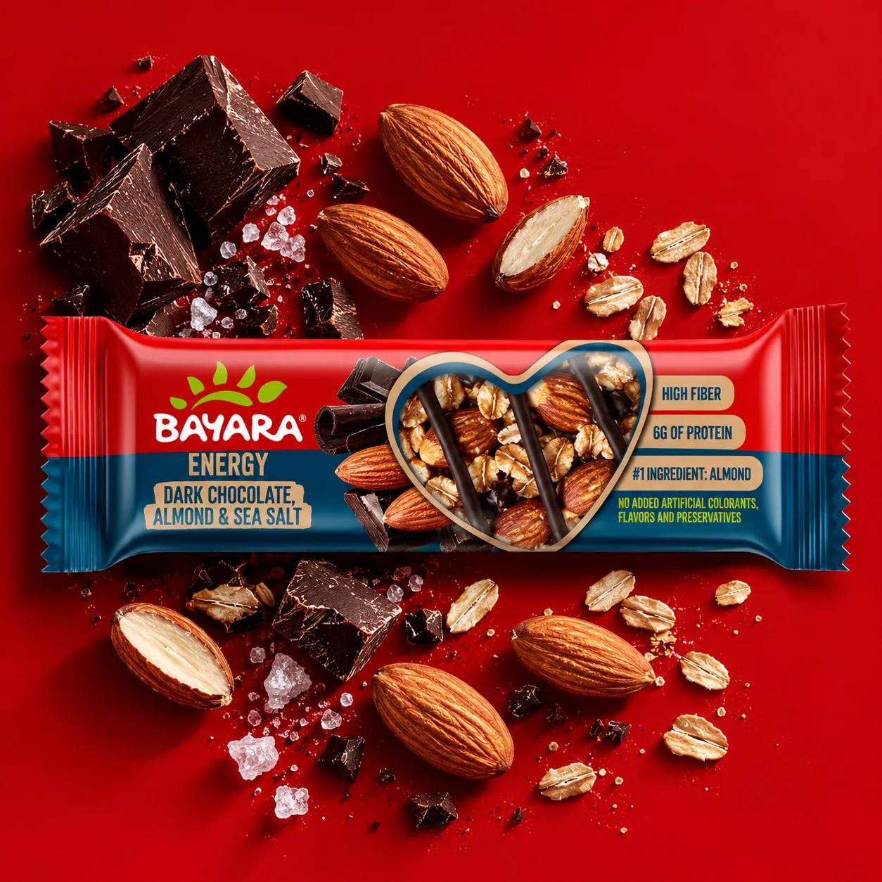
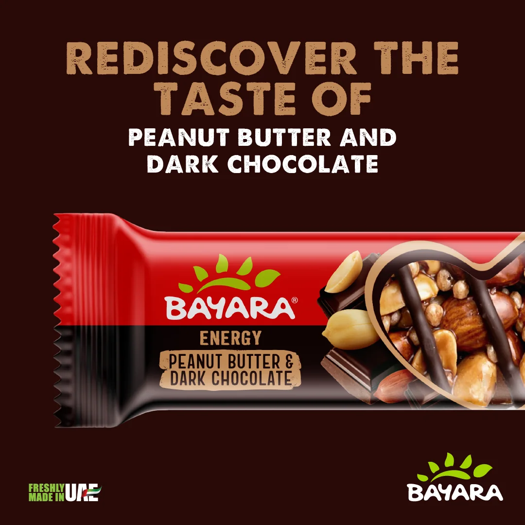
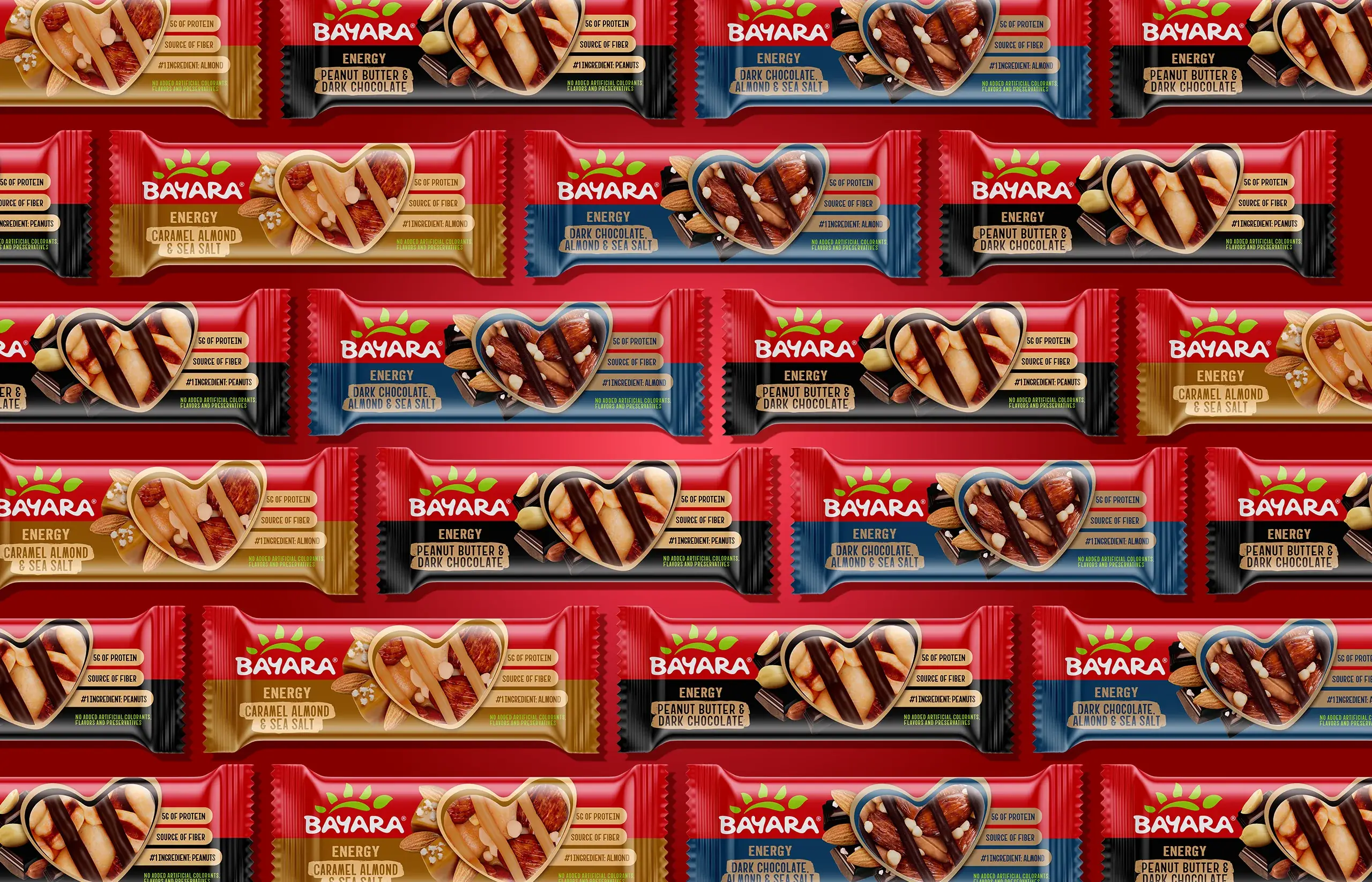
We kept Bayara’s distinctive red at the centre of the system and used the product itself to do much of the selling.
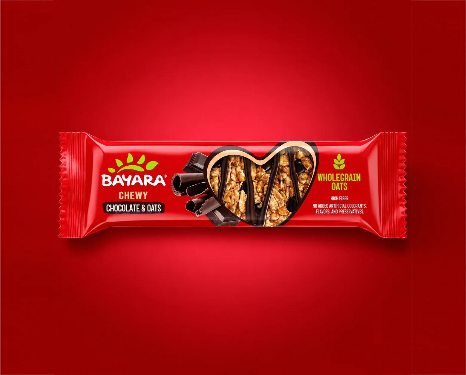
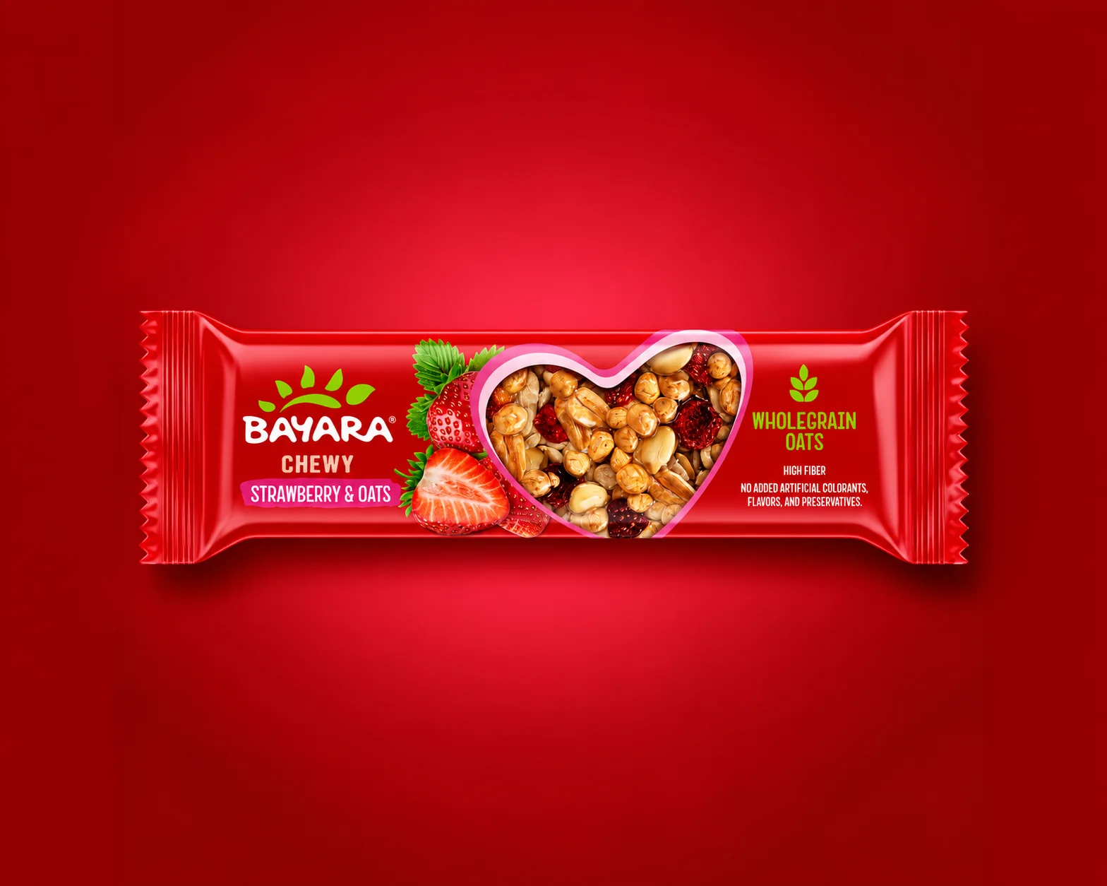
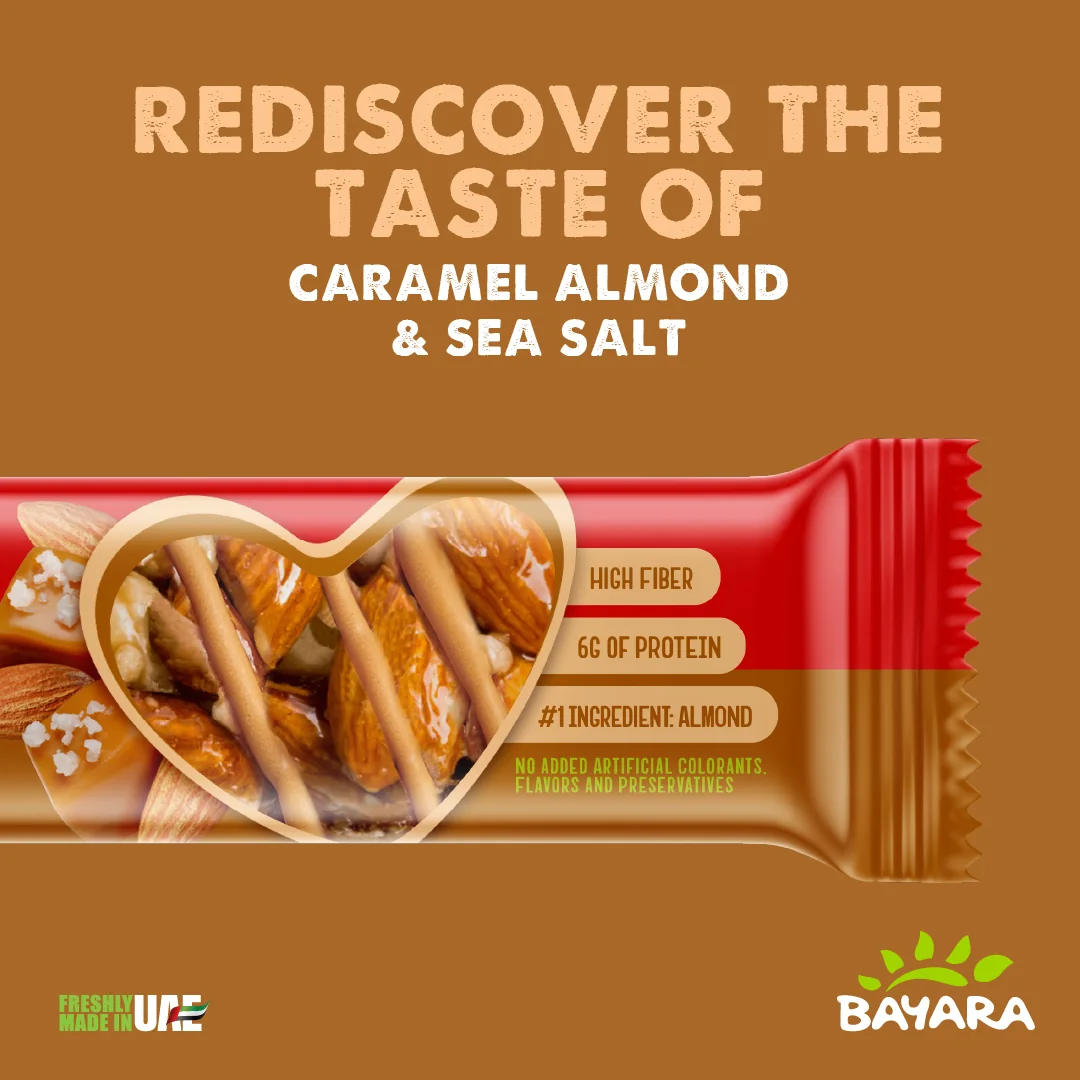
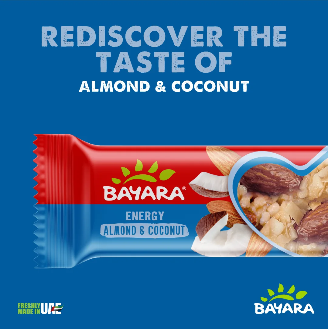
Large ingredient imagery makes flavour recognition immediate. Oats, berries, chocolate, honey and nuts appear prominently, helping shoppers understand each variant before they begin reading the detail.
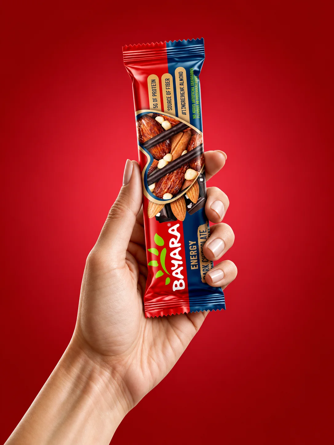
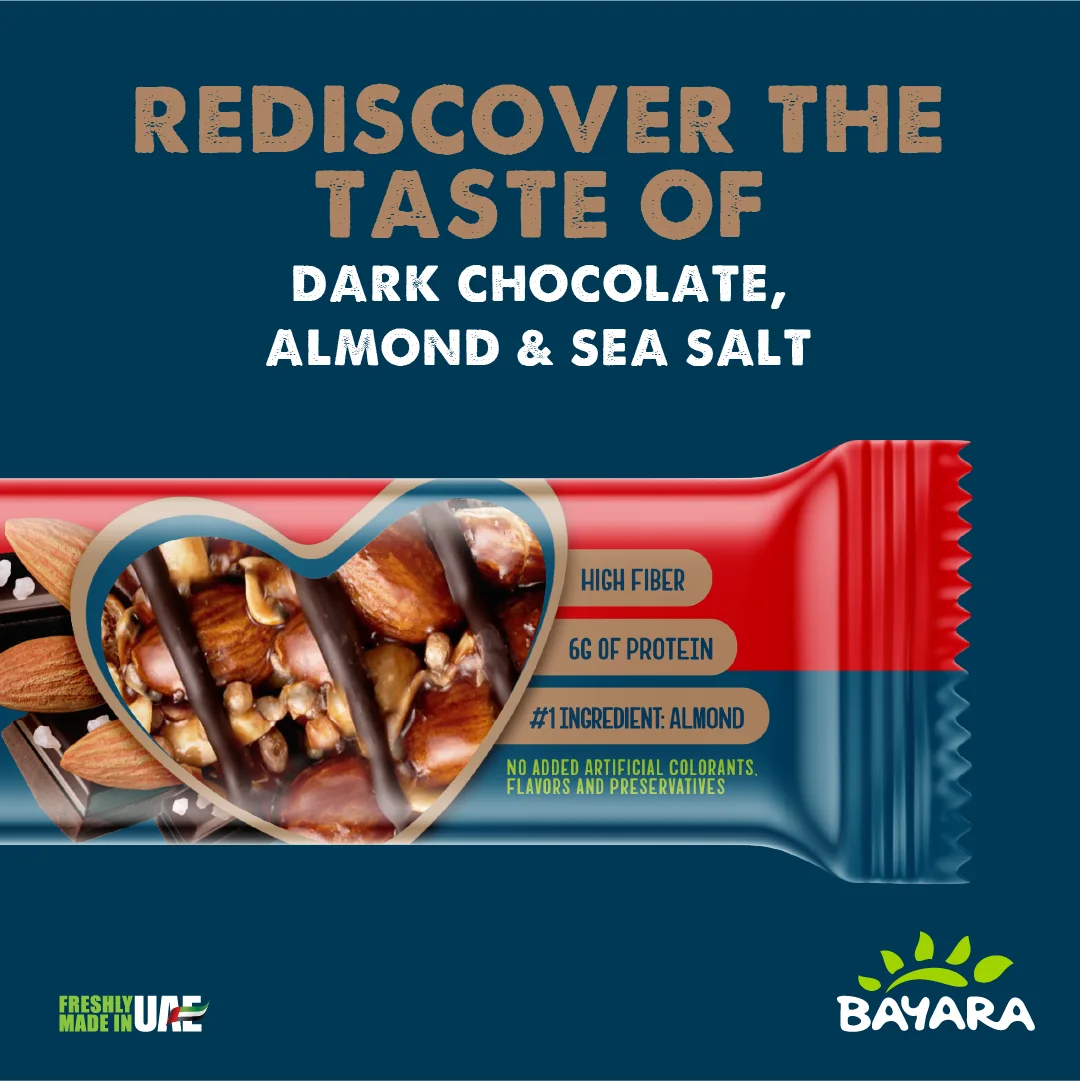
The bar itself becomes part of the visual language too. Product windows, ingredient compositions and appetite-led photography communicate texture and give the range a more tangible, honest feel.
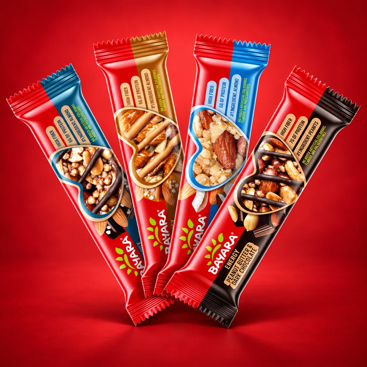
Colour is used selectively rather than replacing the Bayara red. Secondary colour cues help distinguish flavours while allowing the full range to remain clearly connected on shelf.
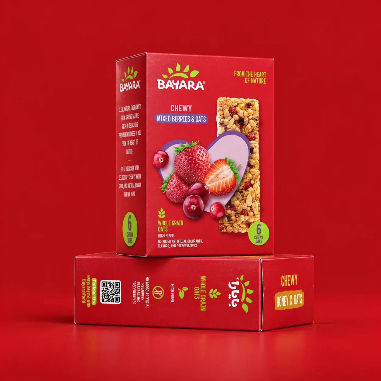
Claims such as whole grain oats, fibre and key product benefits are organised into a stronger hierarchy, giving consumers the information they need without overwhelming the front of pack.
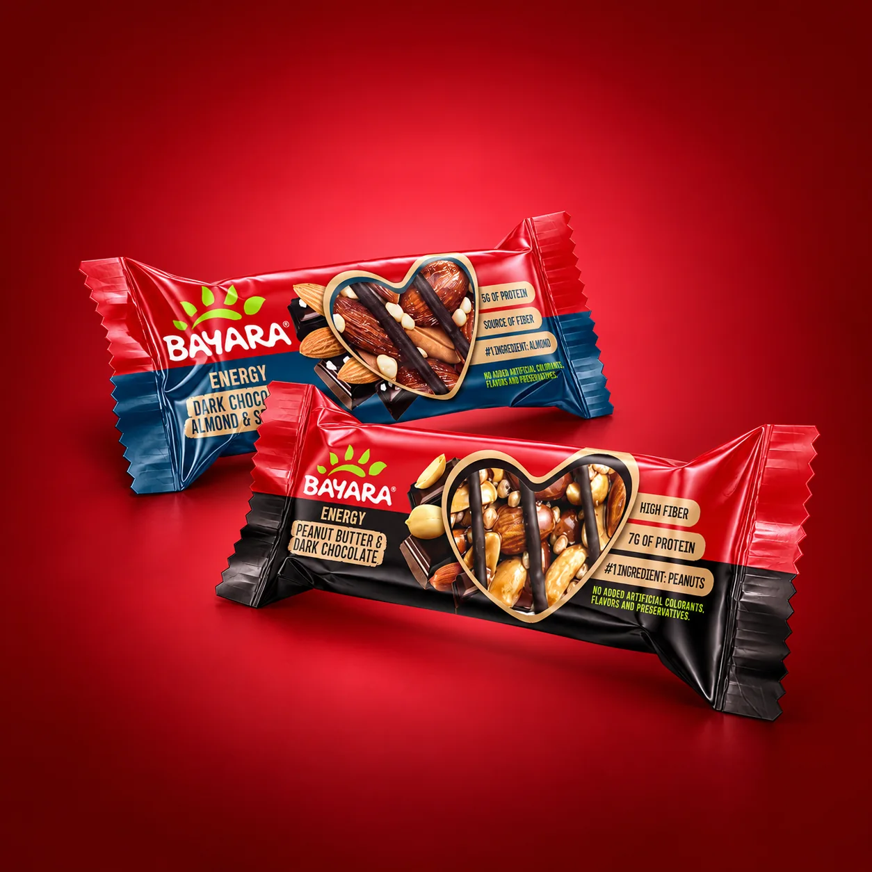
The same architecture was developed to work across both single snack bars and multipack cartons, creating a consistent system rather than a collection of separate designs.
A range built around recognition
Bayara already had one of its strongest assets: its red.
The redesign did not try to move away from that recognition.
Instead, we made it work harder.
Across chewy oat bars and the wider snack bar range, the red creates instant family recognition while flavour, ingredients and product photography give each SKU its own identity.
The result
A clearer and more flexible packaging system for a growing snack range.
One that keeps Bayara recognisable, makes flavour easier to navigate and gives oats, fruit, nuts, honey and chocolate the appetite appeal they need at the point of choice.
No fake luxury.
Just clearer packaging for everyday products people actually buy.
Have a product that needs to work harder?
Whether you are launching something new, rebuilding an existing brand or trying to make a complex portfolio clearer, we can help.