A water enhancer designed to make plain water worth drinking.
Lemonadas — Water enhancer brand strategy, identity & packaging design
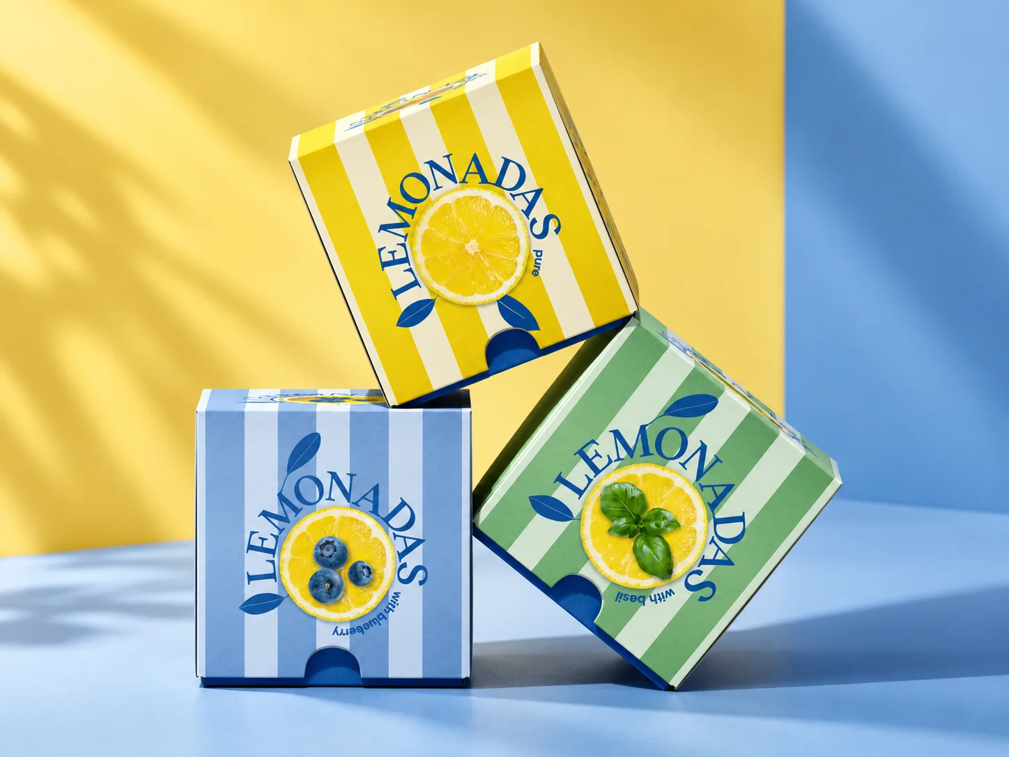
A distinct water-enhancer brand and packaging system that explains an unfamiliar product and supports new flavours.
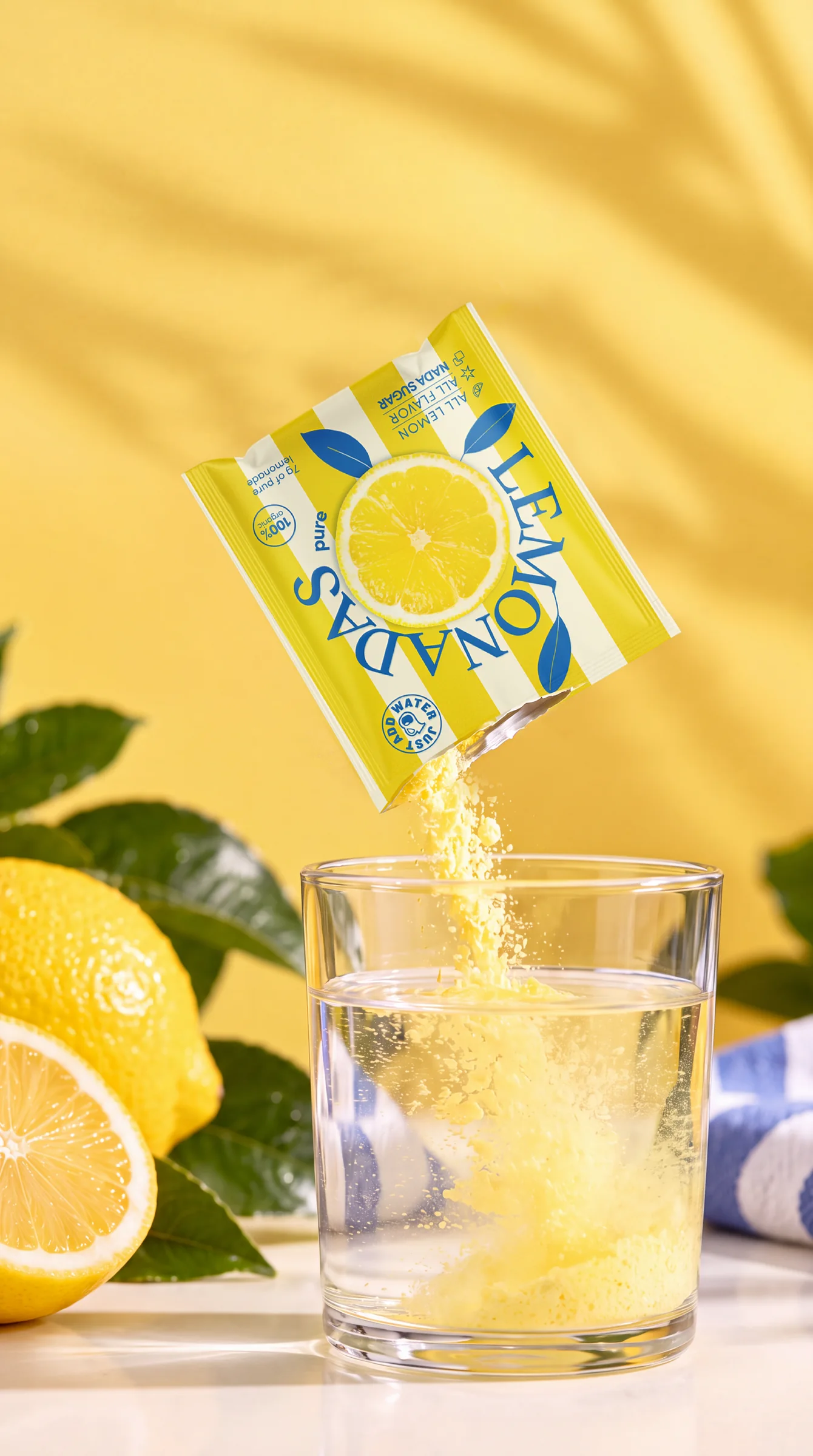
ZERO11 created the brand strategy, positioning, visual identity, packaging design and range architecture for Lemonadas, a water enhancer built around freeze-dried lemon powder that turns everyday water into a fresh, flavourful drink in seconds. Water enhancers are still unfamiliar to many consumers, so the pack had to attract attention, explain the product and communicate flavour quickly, with a system flexible enough to grow as new flavours and formats are introduced.
About the client
Lemonadas is a water enhancer brand built around freeze-dried lemon powder, created to turn everyday water into a fresh, flavourful drink in seconds.
The product starts with real lemon and a simple proposition: make drinking water more enjoyable without relying on the conventions of traditional bottled soft drinks.
The range combines a distinctive lemon base with different flavour variations, creating a product that sits naturally between hydration, refreshment and everyday convenience.
The brief
The challenge was bigger than designing attractive packaging.
Water enhancers are still an unfamiliar category for many consumers. The pack therefore had to do several jobs very quickly: attract attention, explain the product, communicate flavour and make the idea of adding Lemonadas to water feel simple and desirable.
At the same time, the brand needed enough personality to stand apart from functional hydration products, powdered drinks and conventional lemonade.
The system also had to be flexible enough to grow as new flavours and formats were introduced.
The design solution
We built Lemonadas around a simple idea: make water something people actually look forward to drinking.
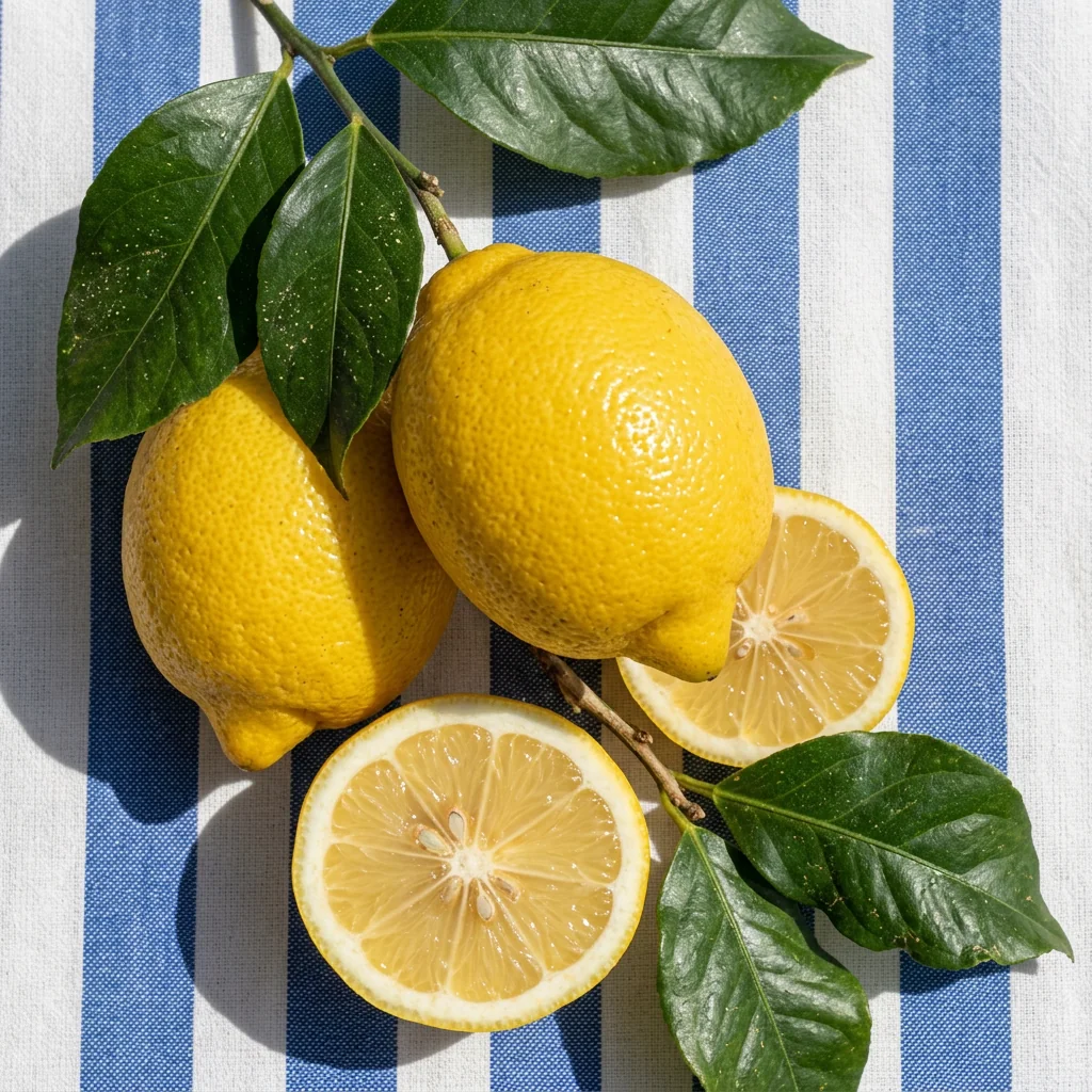
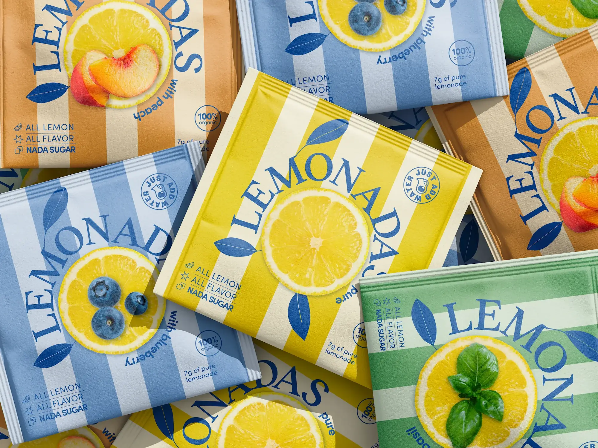
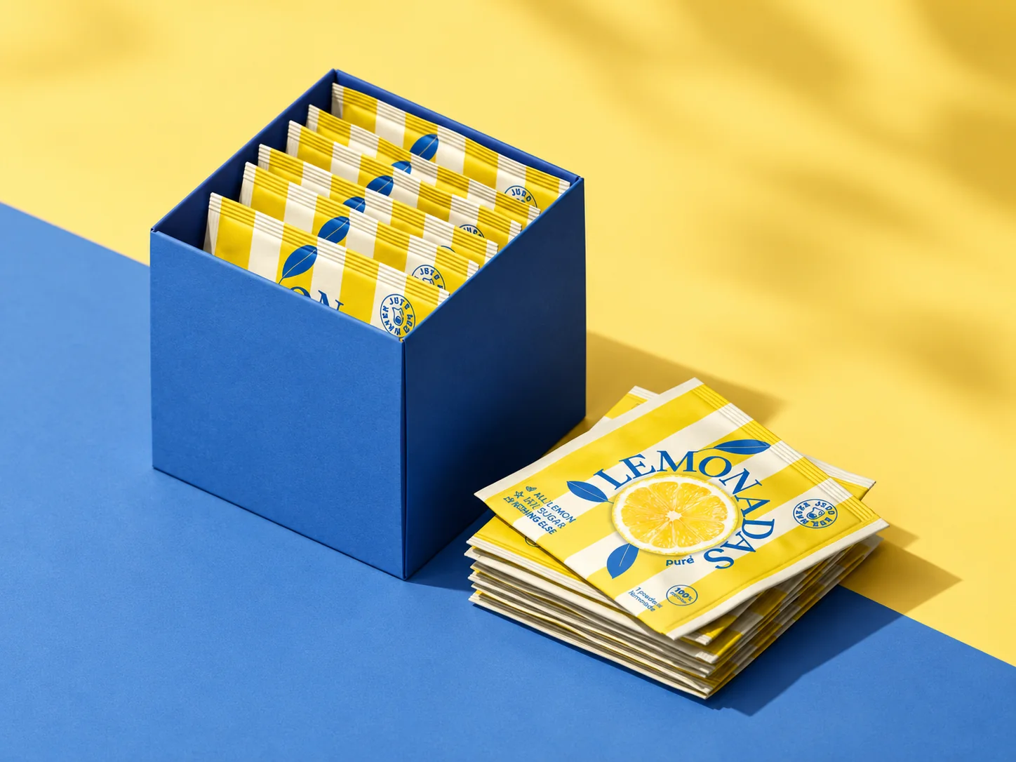
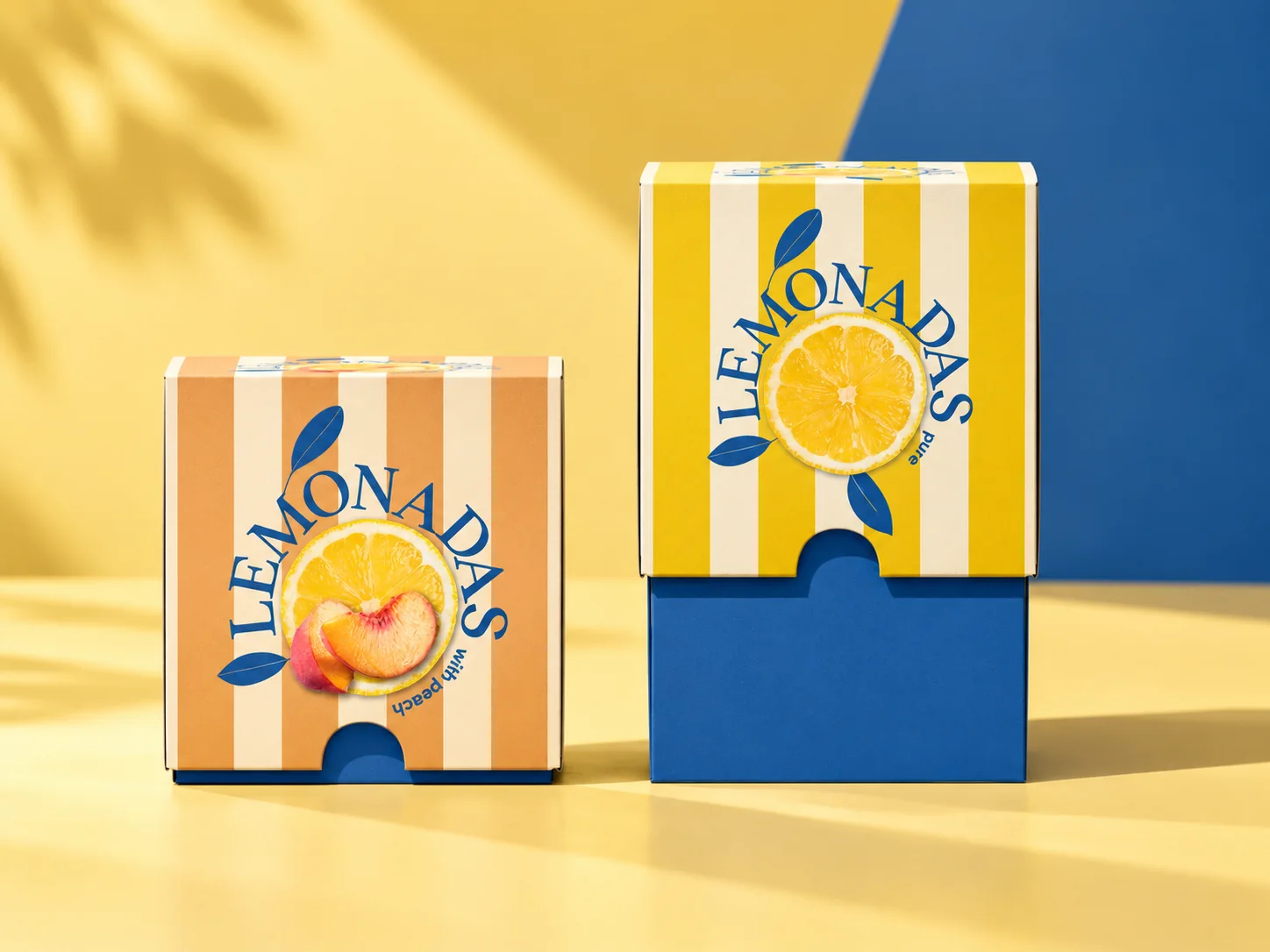
The identity uses bold stripes, fresh colour combinations and a large circular Lemonadas wordmark wrapped around the product’s central ingredient. The lemon becomes both the visual anchor and the clearest explanation of what the brand is about.
Each flavour has its own colour world, while the repeated structure keeps the range immediately recognisable.
Yellow communicates the purity and brightness of lemon. Blue, green and other flavour colours create clear differentiation without breaking the family resemblance.
The packaging was designed as a system rather than a collection of individual packs. The same visual language can move across flavours, boxes, pouches and future formats while keeping Lemonadas recognisable at a glance.
The result is a brand that feels refreshing, uncomplicated and distinctive, with packaging that explains a relatively new product idea without making people work to understand it.
A flexible packaging system designed to grow with the brand.
Have a product that needs to work harder?
Whether you are launching something new, rebuilding an existing brand or trying to make a complex portfolio clearer, we can help.