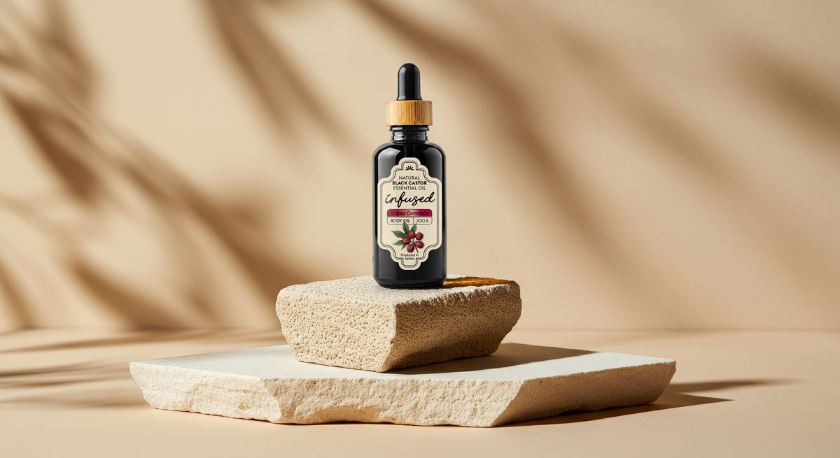
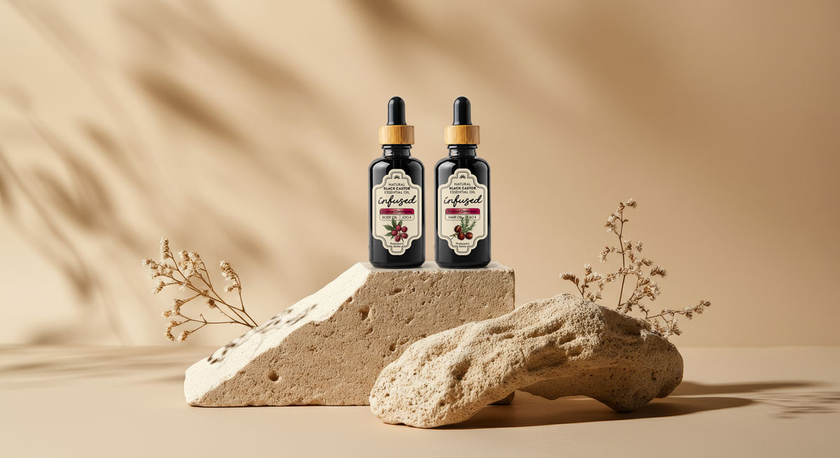
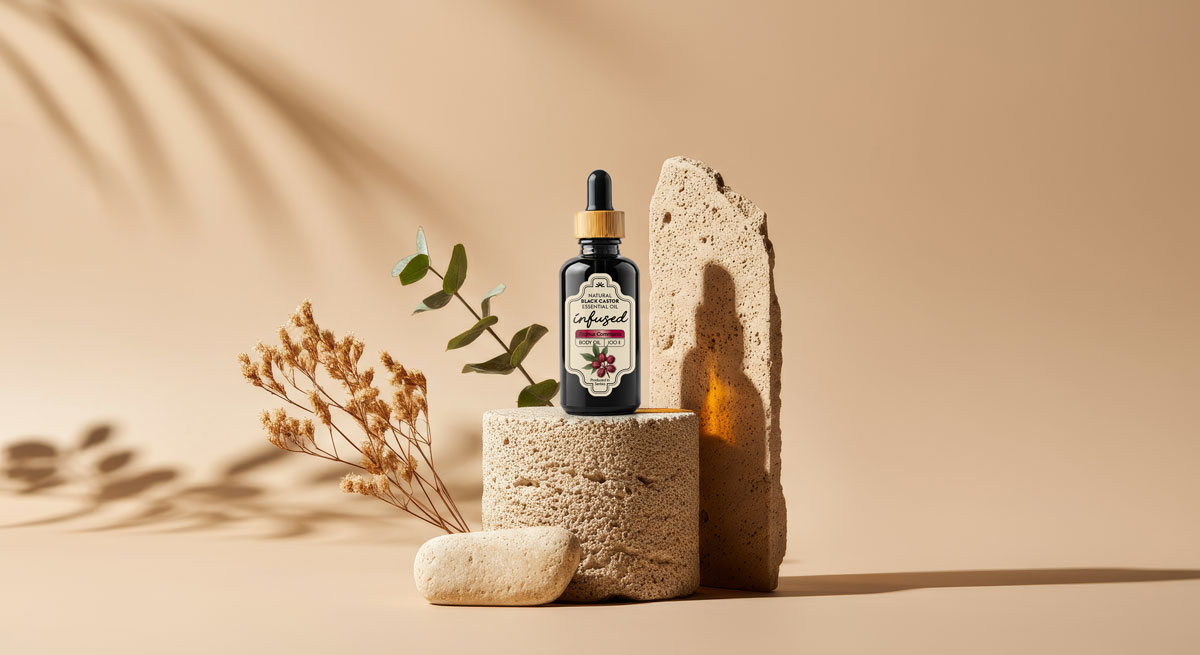
A heritage-inspired label system crafted for purity, trust and small-format usability.
Packaging design, visual direction and illustration development.
About client
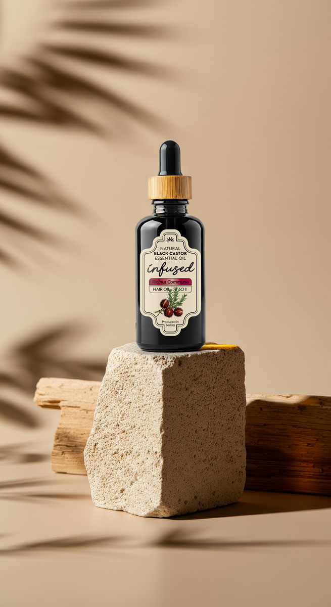
The client produces natural, infused Jamaican Black Castor Oil using traditional methods and locally sourced botanicals. Their products are rooted in craft and heritage, with a focus on purity, authenticity and wellness. The brand needed packaging that reflected this tradition while appealing to a modern audience that values clean, honest and effective natural products.
Brief
The labels needed to capture a vintage apothecary feel without appearing outdated or overly nostalgic. The client wanted the charm of early 1900s herbal packaging, inspired by handwritten notes, botanical sketches and old pharmaceutical bottles. At the same time, the design had to work across multiple bottle sizes, including a very small format where clarity becomes a real challenge. The goal was to communicate natural quality and product purity in seconds.
Solution
We explored historical references ranging from botanical journals to early apothecary containers to build a design language that felt authentic rather than decorative. Custom illustrations were developed to echo hand-drawn botanical art, supported by a calm, honest typographic structure. The labels were refined to maintain legibility across 100 ml, 50 ml and 5 ml bottles, keeping essential information clear even at the smallest scale.
The final system balances heritage with modern usability. It feels crafted but not cluttered, traditional but not old-fashioned. The result is packaging that communicates purity, trust and natural efficacy with immediate clarity. The infused castor oils now sit confidently on the shelf as premium yet approachable wellness products.

