Packaging design, visual refresh, creative direction and art direction.
About client
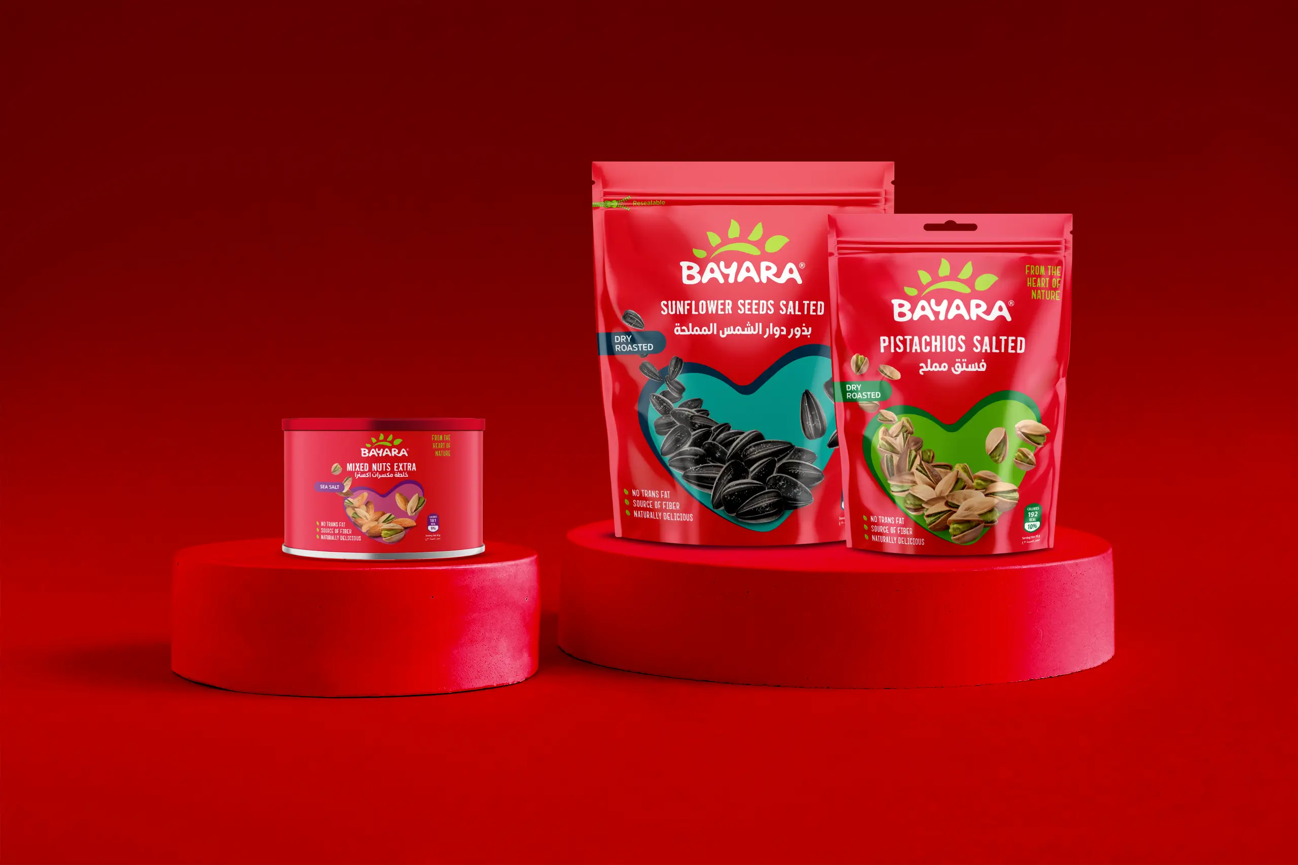
Bayara is one of the most recognisable food brands in the Middle East. Known for its wide range of spices, herbs, nuts, dried fruits and snacks, the brand has built strong regional trust over many years. Its signature red sachets are a familiar sight in kitchens and supermarkets across the GCC, making visual consistency a key part of its equity.
Brief
The task was to modernise Bayara’s packaging while protecting what mattered most. The red sachets were non-negotiable because they drive instant shelf recognition. The challenge was to refresh the look, improve clarity and enhance appetite appeal without losing the spirit of the original design. The goal was simple. Update the brand for today and make it even stronger in a competitive category.
Solution
We introduced a bold, unified red theme across the snack range to reinforce the brand’s visual equity. High-quality product photography was used to create vivid appetite cues. The layout was cleaned and refined for clarity, helping consumers identify products quickly and confidently. Each pack feels modern and true to the brand’s heritage. The result is a refreshed Bayara that stands out more sharply on the shelf while staying instantly recognisable. The familiar red sachet remains central, now elevated with a cleaner and more contemporary presence.

